(Welcome to our three-part series on the psychology of great retail store interior design. Today’s post, Part 1, focuses on color. Sign up for blog updates to get the next installments right in your inbox!)
Before diving in, let’s get the elephant in the room out of the way. If you’re here and reading this, it’s probably because of one of two reasons: You don’t believe that retail is dying, or you think that it is dying and you’re wondering why anyone would want to build a brick-and-mortar store.
Retail stores used to be a destination in themselves. When consumers can order most things through the internet, there’s less reason to leave the house.
The key phrase here is less reason, not no reason:
In-store expertise can give you assistance in a way websites can’t.
The instant gratification of immediately acquiring a purchase, absence of return hassles, and no delivery fees are attractive.
Experiencing the merchandise (touching, smelling, interacting) is still a need that exists.
And more.
Convinced? We now figure out how to get your customers to walk into your store and purchase — let’s start with color.
When it comes to sales, retail store displays are more than about looking pretty.
73% of purchasing decisions are made in-store.
Potential customers make a subconscious judgement within 90 seconds of entering a store.
62%-90% of first impressions are based on color.
52% of shoppers won’t return to a store if they don’t like the aesthetics.
93% of purchasing decisions are based on visual appearance.
Color advertisements are read 42% more than black and white.
As to indirect effects on your brand and product:
Color increases brand recognition by up to 80%.
Color boosts memory by adding an extra stimulus for the brain.
As a bonus, color can also save you money on operational costs — specifically, heating and cooling. According to Sally Augustin, Ph.D., an environmental psychologist and expert on person-centered design, “The color of a wall can actually change how a person perceives the temperature.”
For example, warm colors such as yellow, orange, and red can make people think that the room is warmer than it actually is. On the other hand, cool colors such as green, blue, and light purple can make people feel like it’s colder.
When it Comes to Retail Store Interior Design, It’s All About Emotions
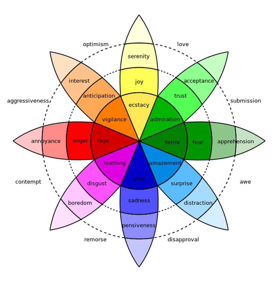
Augustin adds that color evokes emotional responses in most people. Take a look at this diagram by Robert Plutchik:
Image: Wikipedia
While there are general rules that exist about which colors evoke which emotions in people, they are by no means universal. According to Augustin, “People of different cultures may have different thoughts and emotions about certain colors. Also, a person’s past experience can affect feelings about a certain color.”
Using Colors to Attract Your Retail Store’s Target Market
As a general rule, younger shoppers are drawn more strongly to bright, bold colors, while older shoppers prefer subtle ones.
If your product works best as an impulse buy, you may want to use black, royal blue, or red-orange in your display. Are you targeting budget shoppers? Use navy blue or teal.
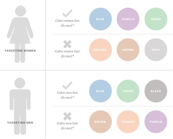
Does your product primarily target female shoppers? Blue, purple, and green are your best bets. Stay away from orange, brown, and gray.
If you’re targeting males, you’ll do well with blue, green, and black, but not with brown, orange, or purple.
Individual Color Psychology in Retail Store Interior Design
According to Cestrian, a visual brand communications company, “The human brain was not designed to navigate the retail environment. But the retail environment has been carefully crafted to navigate the peculiarities of the human brain.”
Another way to put this is that the decision to purchase isn’t made with the brain. Instead, the brain exists to justify the purchase.
Let’s look at how individual colors create specific responses and how you can use them for your business:
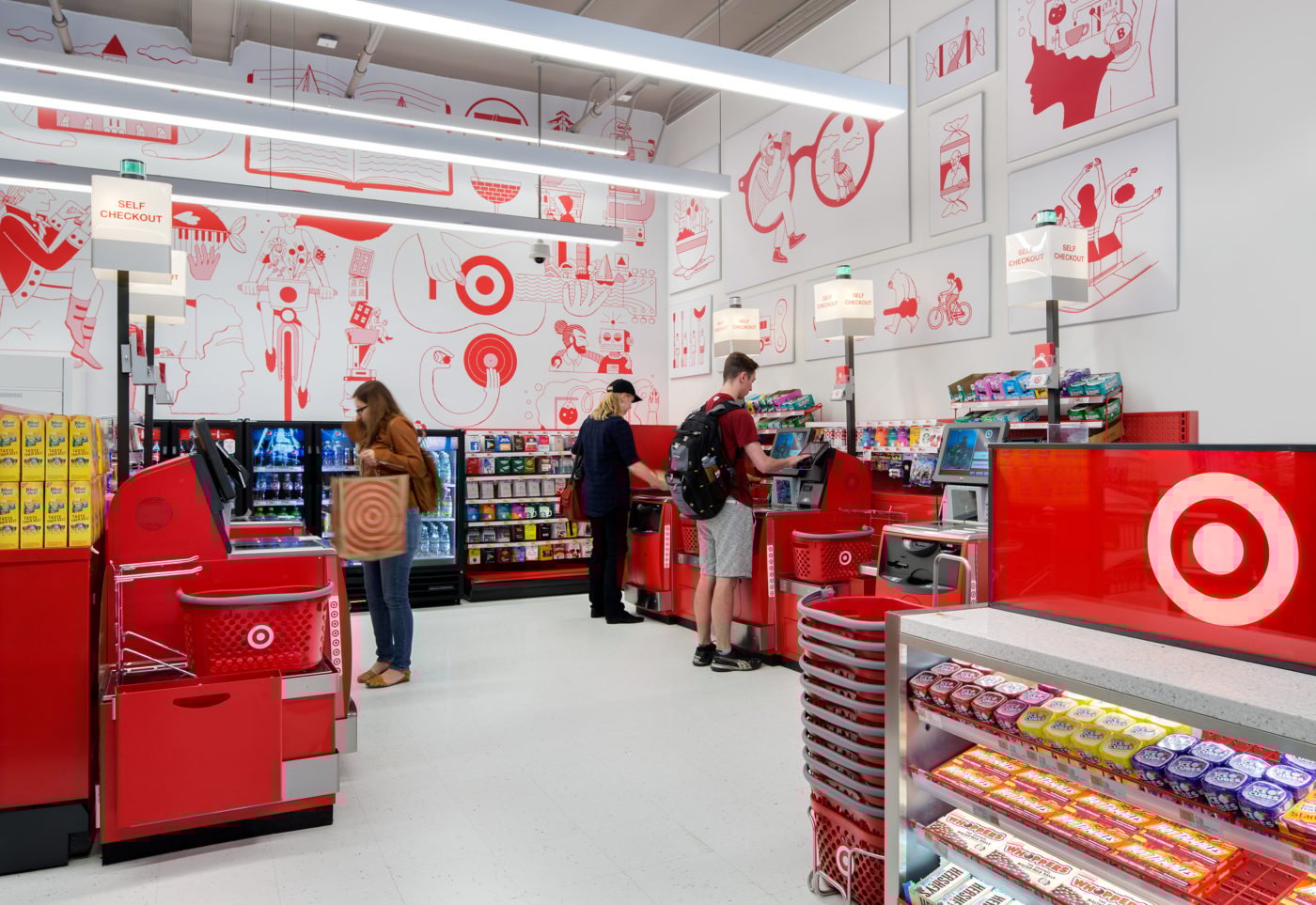
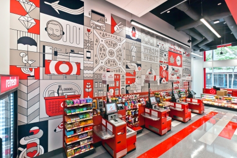
Red grabs attention, increases heart rate, and prompts quick decisions. This is why red is the most preferred color for packaging and signages for sales and sharp price drops: because of its “LOOK AT ME!” effect.
Another reason red is great for sales? It reduces analytical thinking, which means more impulse buying.
There’s a reason Target uses so much red in their stores. Image: Pavlov Images
Besides encouraging impulse decisions, red also increases the appetite, which is why we often see it in fast food dining and candy stores.
Pink evokes happiness, light-heartedness, romance, and calm. It’s no coincidence that Pepto-Bismol is pink: The color itself is enough to start soothing a stomachache sufferer. This soothing effect can be taken to extremes: “Sports teams have been known to paint guest locker rooms pink to drain the opposing team’s energy."Pink became the de facto color for girls after World War 2. It’s primarily used for feminine products, gifts for women, or even cards. It appears that the color pink, which instantaneously makes people think about cute things, makes shoppers want to buy presents for their girlfriends, wives, or mothers, especially around holidays such as Valentine’s Day.
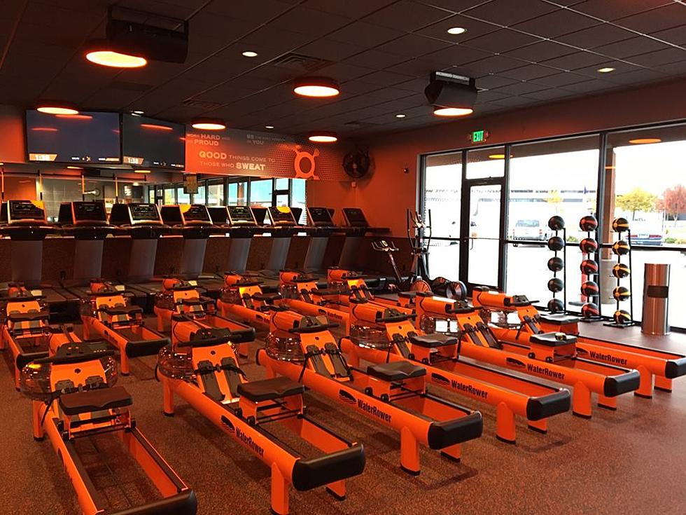
Orange makes people happy. (Hello? Clinique Happy?) It’s the color of energy and enthusiasm, and it has a positive affect on people. Orange is motivating, hence why Orangetheory and a lot of other fitness brands use it.
Gets your blood pumping, doesn’t it? Image: Orangetheory
This color would then be well suited to fitness products, such clothing, gym equipment, supplements, and the like.
Blue inspires security and trust, which is why we often see it in financial institutions. It also instills a sense of cal, because it is reminiscent of the sky and ocean.
If you want to take advantage of this effect, especially if you’re selling noisy pets such as birds, Michelle Reynolds recommends this: “Try painting with a dark-medium shade at the bottom of your walls and gradually get lighter, ending in white at the very top. This use of blue reinforces the perception of a calming sky.”
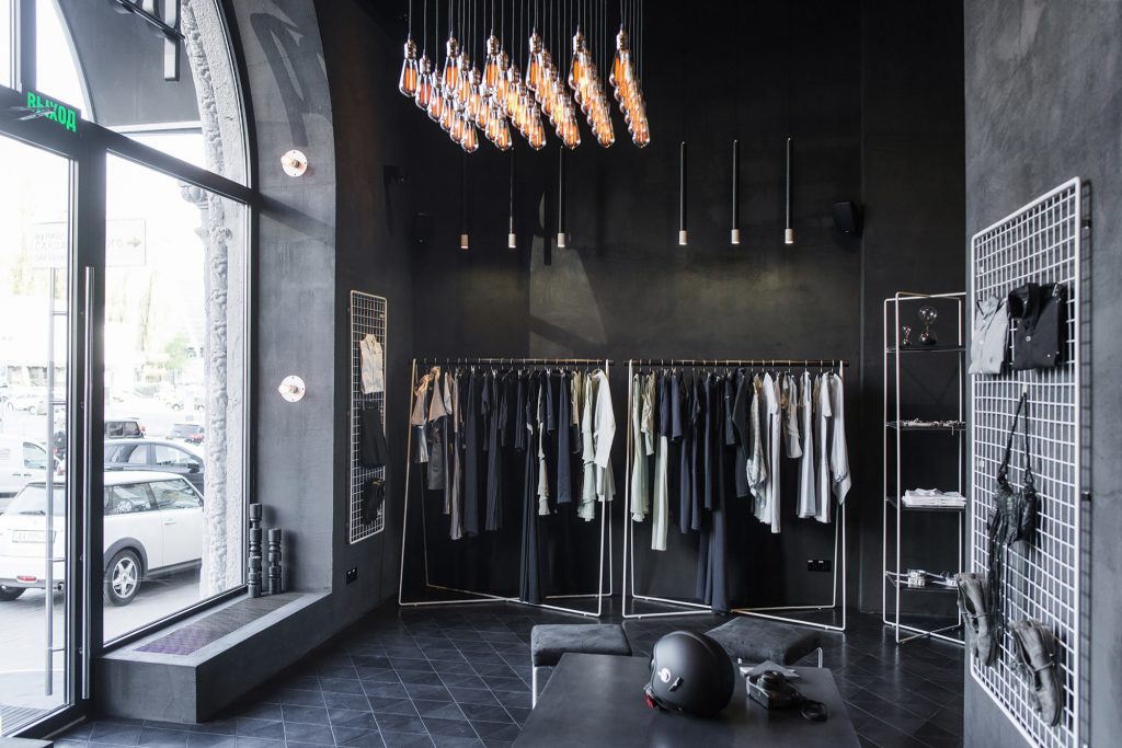
Black produces a general impression of strength, authority, and classiness. It works well as a color for electronics retail stores (such as cellphones and computers), and also for men’s clothing.
Black can be very masculine. Image: Marvolus Manufacturing
In small doses, black is a very effective way to bring attention to certain products. In trendy stores that sell clothing and accessories, for example, you can use black to highlight clearance items and new, high-priced merchandise.
Manage FF&E specification, procurement, and product data at scale. Take on bigger projects with confidence and grow your firm with Fohlio. Schedule a...
Manage FF&E specification, procurement, and product data at scale. Take on bigger projects with confidence and grow your firm with Fohlio. Schedule a...
Manage FF&E specification, procurement, and product data at scale. Take on bigger projects with confidence and grow your firm with Fohlio. Schedule a...