(Welcome to our five-part series on the psychology of great restaurant interior design. Today’s post, Part 1, focuses on color. Stay tuned for the next installments!)
Restaurant interior design is a precise science that aims to tap the diner’s every senses just right. Successful restaurants know exactly who their target clientele are — it’s how they’re able to conceive and build a carefully engineered experience around their needs and desires.
Sight is almost always the first means by which you gather information — and make judgments — on an establishment.
Restaurants know this, and they take great pains to use it to send the right information.
Color, for example, is a powerful tool for influencing customer behavior.
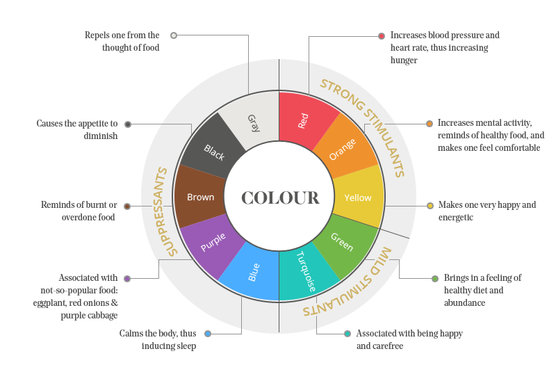
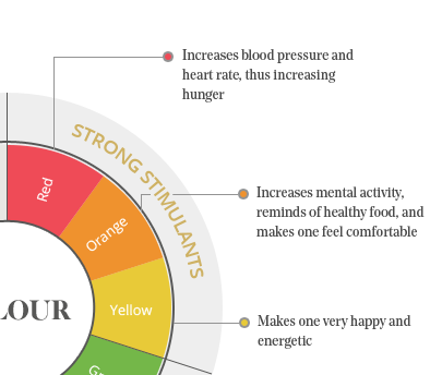
In restaurant interior design, the color wheel can be divided into three sections, according to its effect on appetite: Strong Stimulants, Mild Stimulants, and Suppressants.
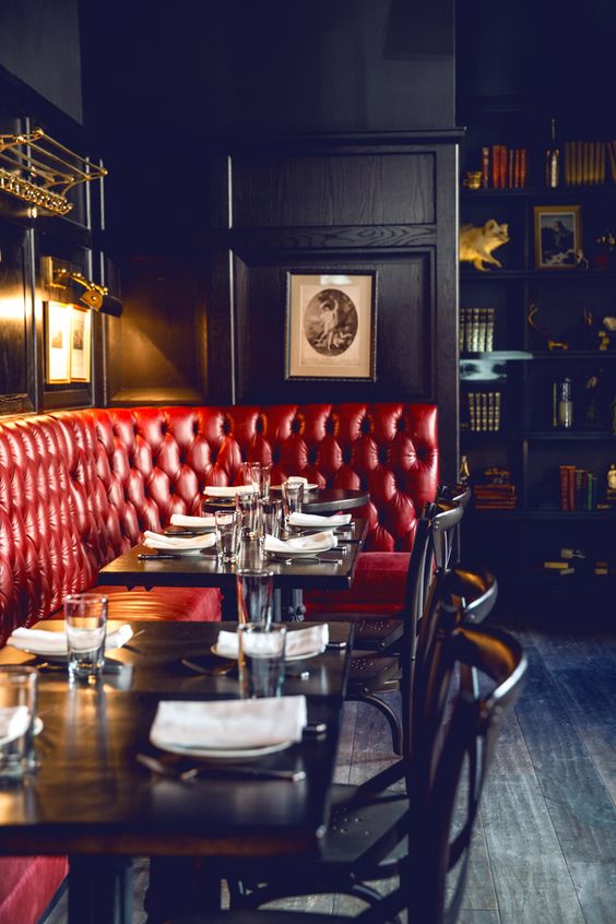
If you’ve ever thought that almost all restaurants use red in some form or shade in their design scheme, well, you’re not imagining things. It’s a well-established fact that red is the most effective color in stimulating the appetite.
Why is this? Red is abundant in nature, and the brain’s reptilian response to it is a carryover from the days when our ancestors were still hunters and gatherers. Red, especially bright reds, would usually signal energy-dense, sugar-packed fruit or vegetables.
Orange and yellow are also appetite stimulants. Yellow is associated with happiness, which is usually associated with a full stomach. When you see yellow, therefore, your brain secretes serotonin in anticipation of the food you’re about to eat.
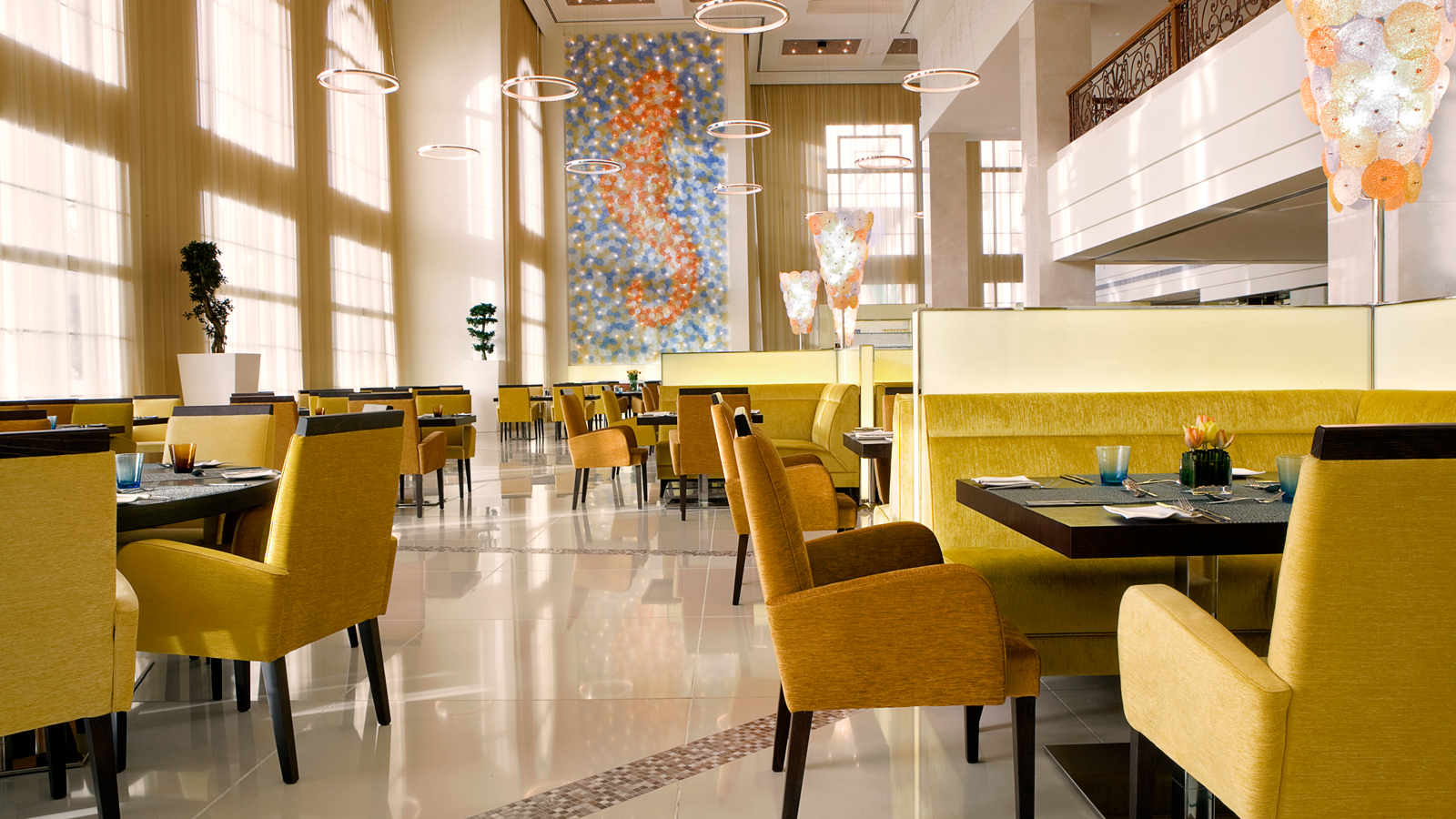
Blue Orange Restaurant, Dubai. Image: The Westin Dubai
Orange, on the other hand, elicits feelings of warmth and comfort — emotions that are also tied to the security of an abundant table.
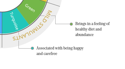
Green and turquoise are mild stimulants. You might argue that green should be a strong stimulant because many leafy vegetables are green, and you’d be partly correct. Green signals edible, benign, non-poisonous plants. However, these plants are merely fibrous, not sugar-packed like most colorful fruit, which provide a jolt of energy.
These days, green is also associated with health. This is unsurprising, given that, again, most green things are fibrous and don’t have sugar.
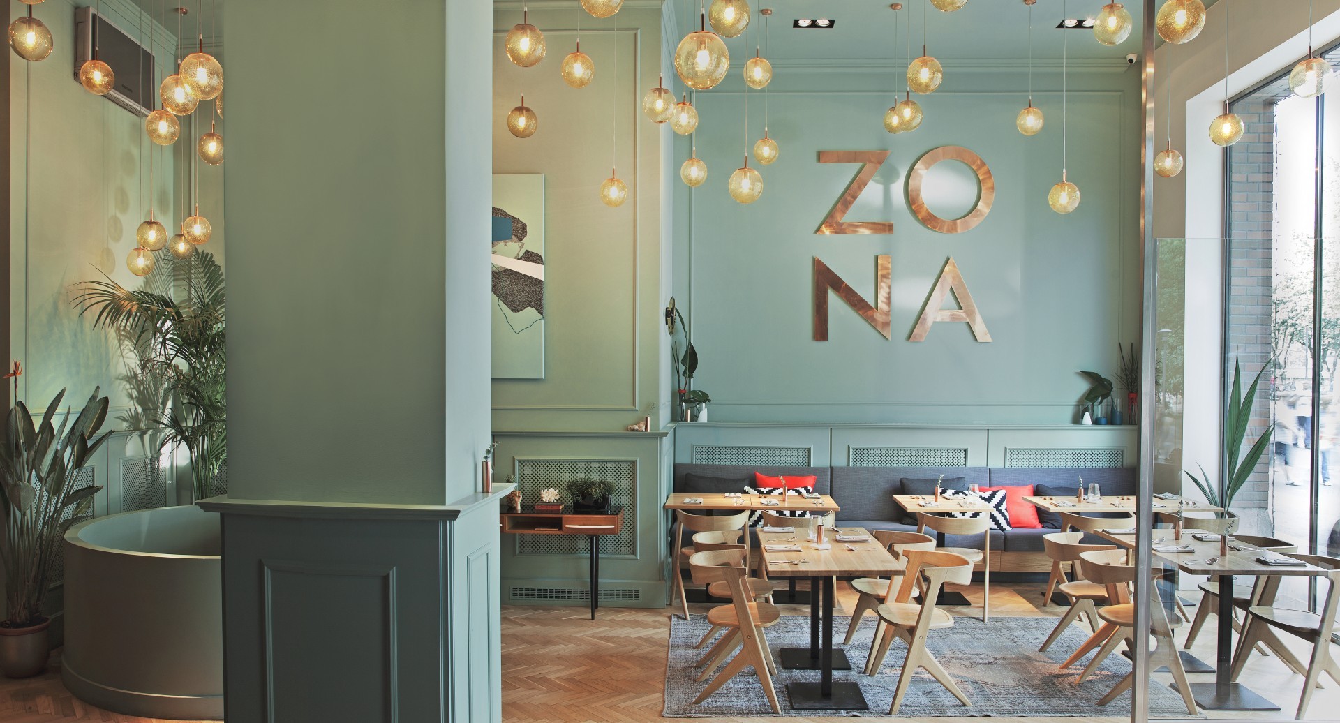
Zona Restaurant, Budapest. Image: Position Collective
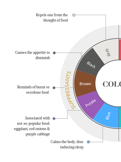
Lastly, black, brown, purple, and blue are appetite suppressants. Research suggests that this is because these colors don’t exist in nature — that is, not in the form of food.
Long ago, blue, black, and purple also signaled something that was either rotten or poisonous, which our ancestors learned to avoid by sight. Like our brains’ response to red, orange, and yellow, this is also a carryover from those days.
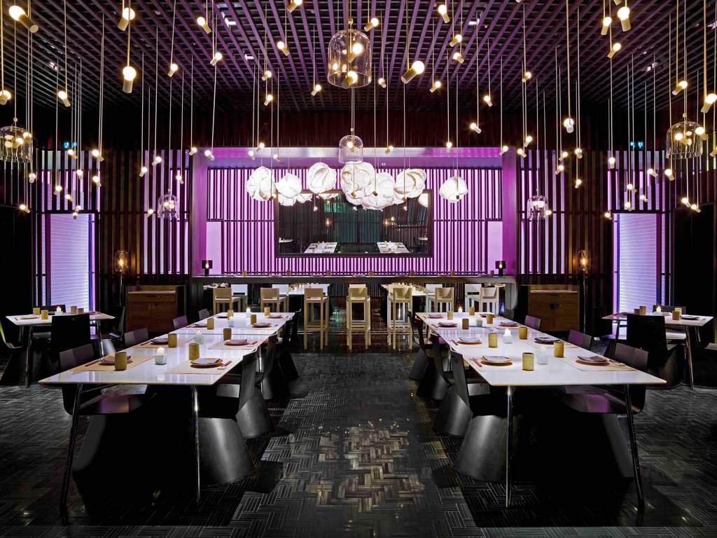
The Opposite House Hotel, Beijing. Image: Kengo Kuma and Associates
We hope you enjoyed Part 1 of our series on restaurant interior design. We’ll publish the next installments over the next few days, so keep an eye out! In the meantime, try putting together a mood board for your dream restaurant using Fohlio!
Manage FF&E specification, procurement, and product data at scale. Take on bigger projects with confidence and grow your firm with Fohlio. Schedule a...
Manage FF&E specification, procurement, and product data at scale. Take on bigger projects with confidence and grow your firm with Fohlio. Schedule a...
Manage FF&E specification, procurement, and product data at scale. Take on bigger projects with confidence and grow your firm with Fohlio. Schedule a...