(Welcome to our five-part series on the psychology of great hotel interior design. This post, Part 1, focuses on colors. Sign up for our newsletter to get the next installments in your inbox!)
Few projects are more intimate than hospitality design. After all, a hotel is a home away from home — a place to rest our weary bodies, and one that provides security when we are at our most vulnerable.
Just as universal as this concept is color as a language. No matter what dialect you speak, color will stir emotions the same way it does in someone else from halfway around the world.
While certain colors generally invoke the same reactions in most people, it’s still important to note that shade and saturation can drastically change their character.
As a rule of thumb, light colors are perceived as airy and make rooms feel brighter and more spacious. Dark colors, on the other hand, lend sophistication and intimacy.
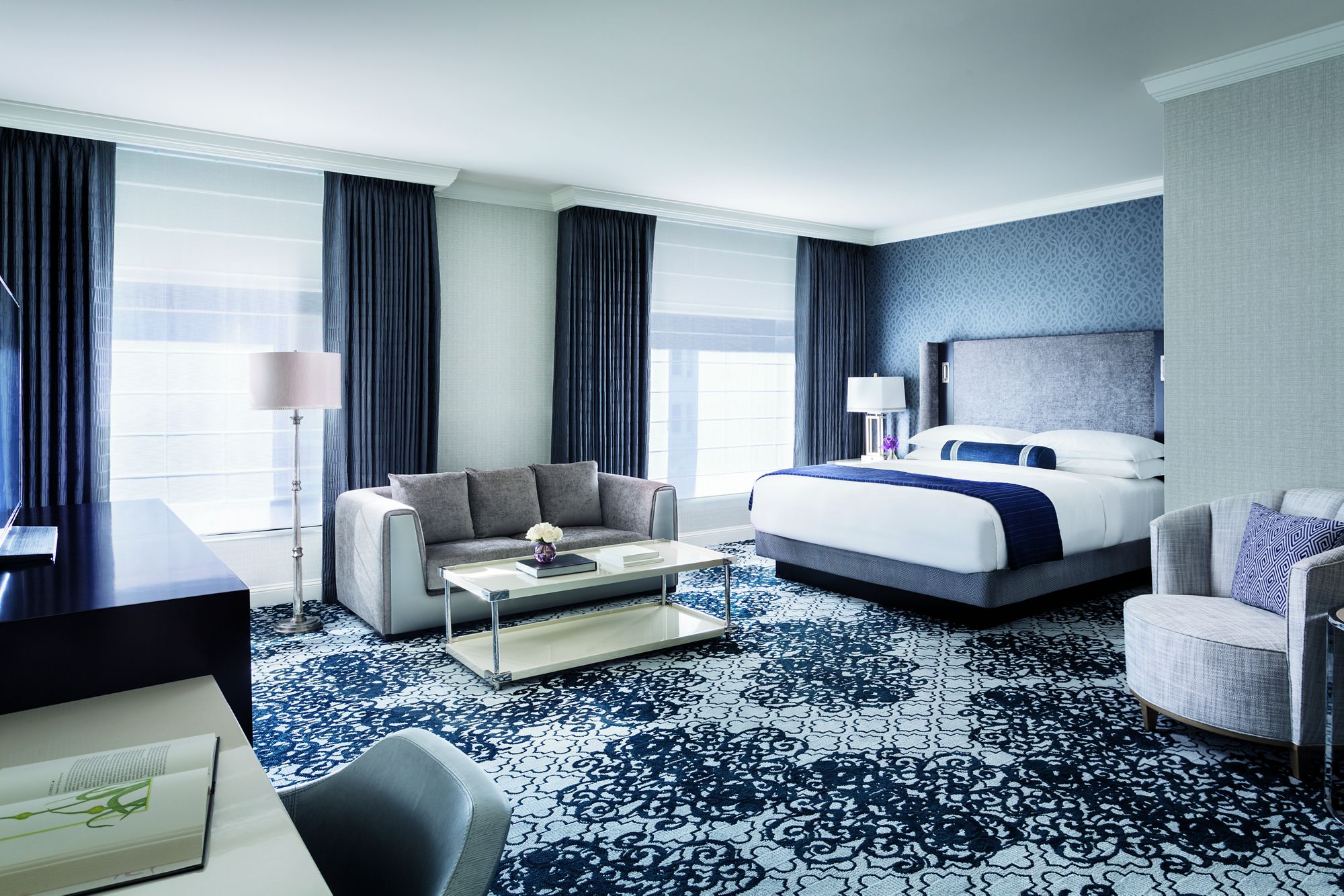
Blues are some of the most universally liked colors: They are generally associated with calmness and serenity, and are therefore some of the best choices for bedrooms and bathrooms.
A good use of a periwinkle palette is a sunny room with large windows, as it can cool the heat and diffuse brightness.
Careful, though: If not balanced with other colors, it can evoke feelings of sadness.
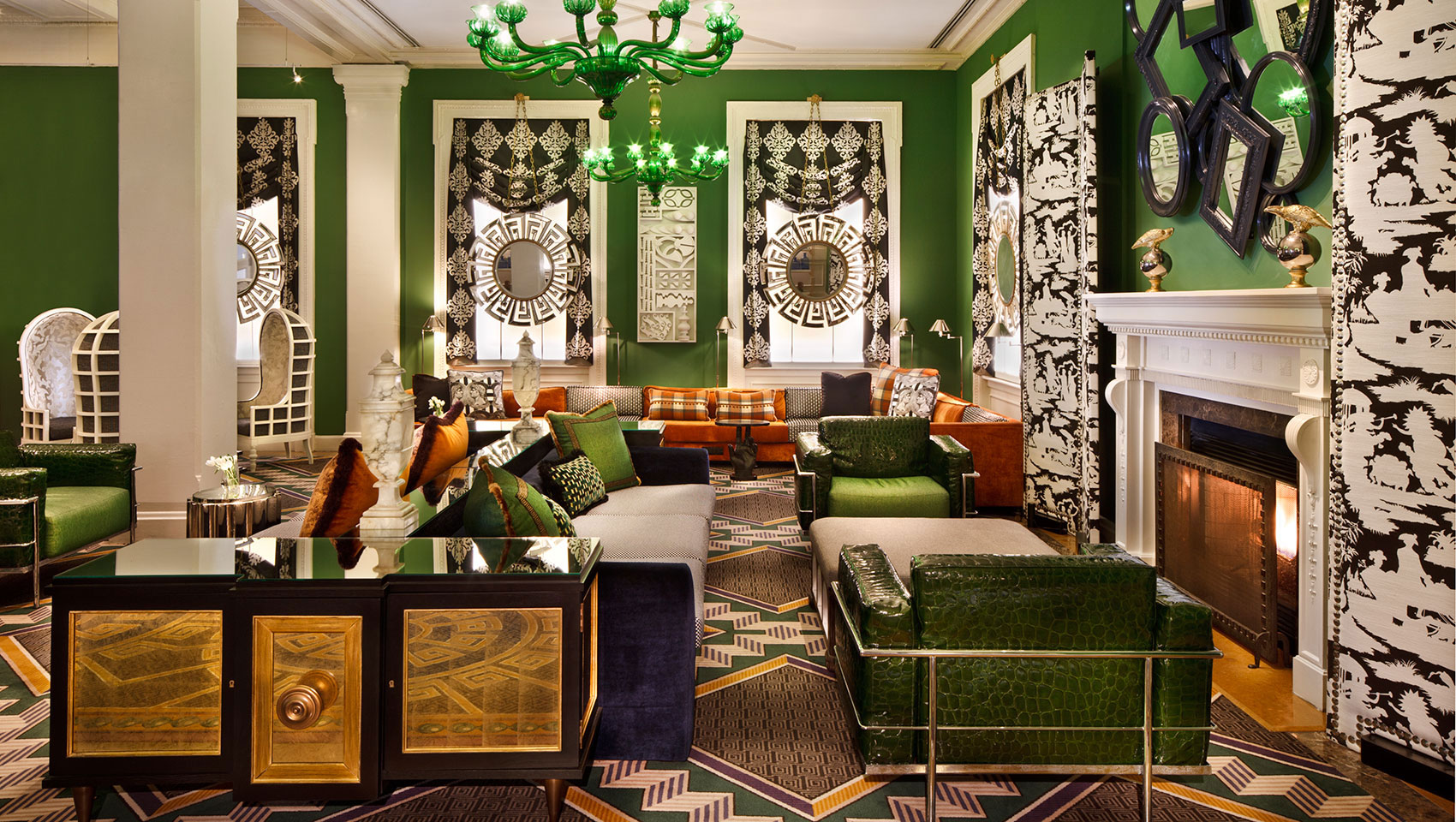
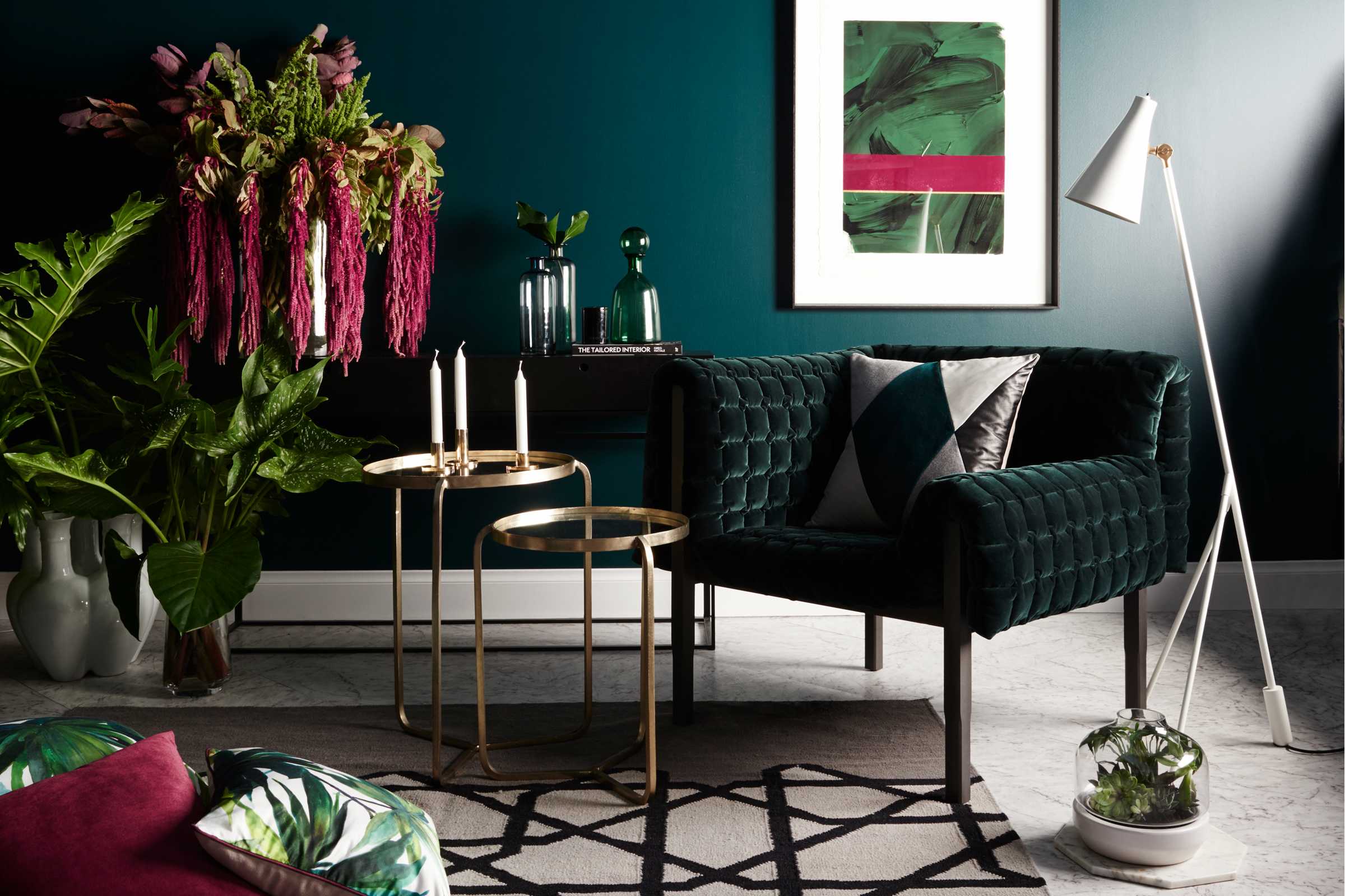
Just as calming and restful is green, although it can also be exciting and refreshing at the same time. It conjures nature, youthfulness, and vibrancy.
Boutique hotels that target a younger audience have more recently started to incorporate verdant and leafy into their palettes. Green is also popular with spas, as these establishments usually come with the promise of renewal and rejuvenation; in other words, a return to youthfulness.
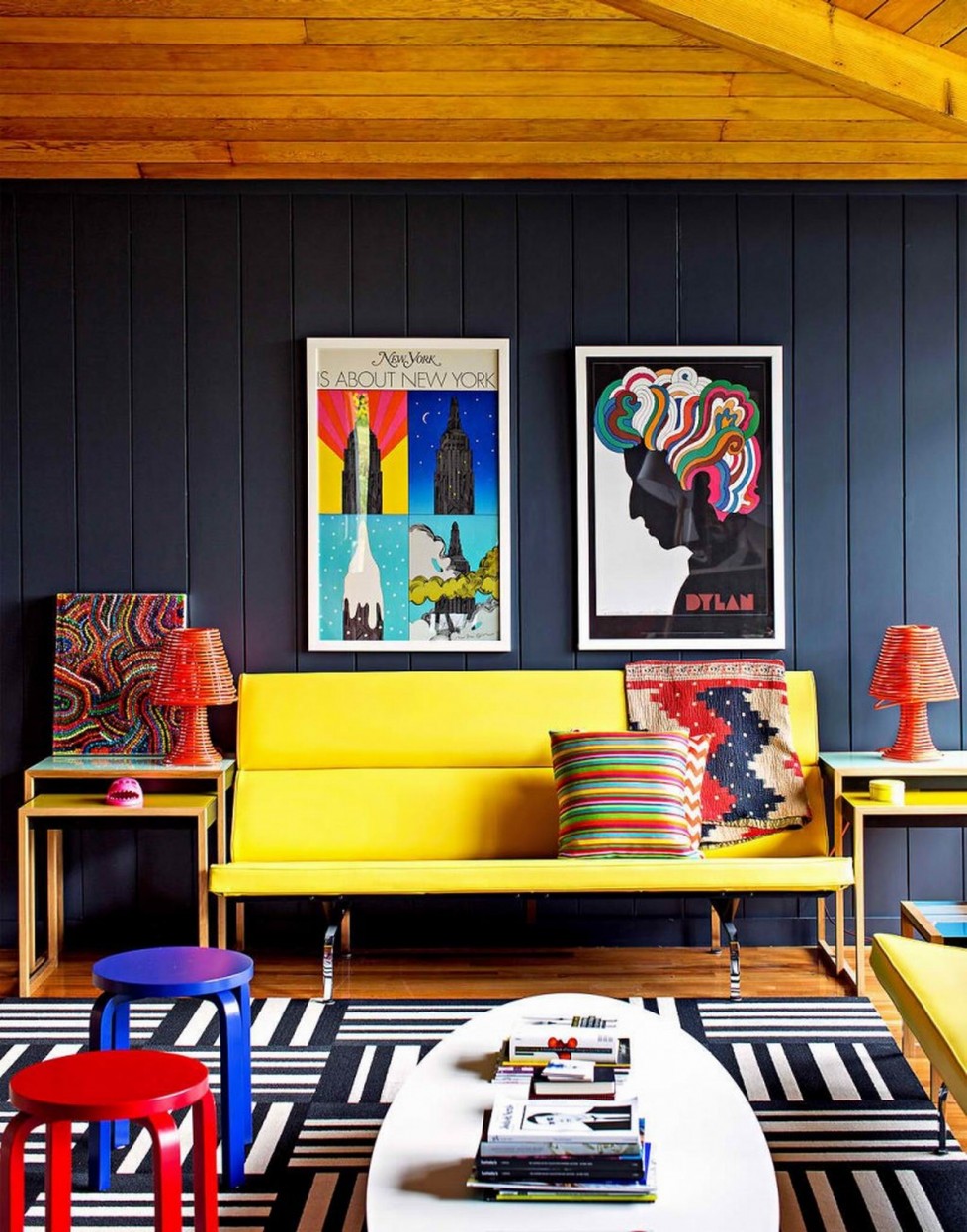
Yellow is bright and optimistic — a small pop in the form of a primrose accent or accessory is often enough to liven things up.
A pale shade on walls or the ceiling, or a saturated accent wall will have the same effect. The latter is especially effective for creating a work or conversation nook, as yellow is a stimulating color.
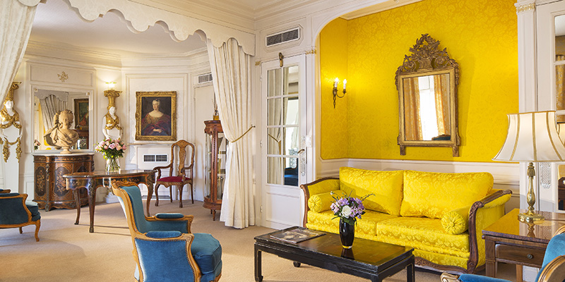
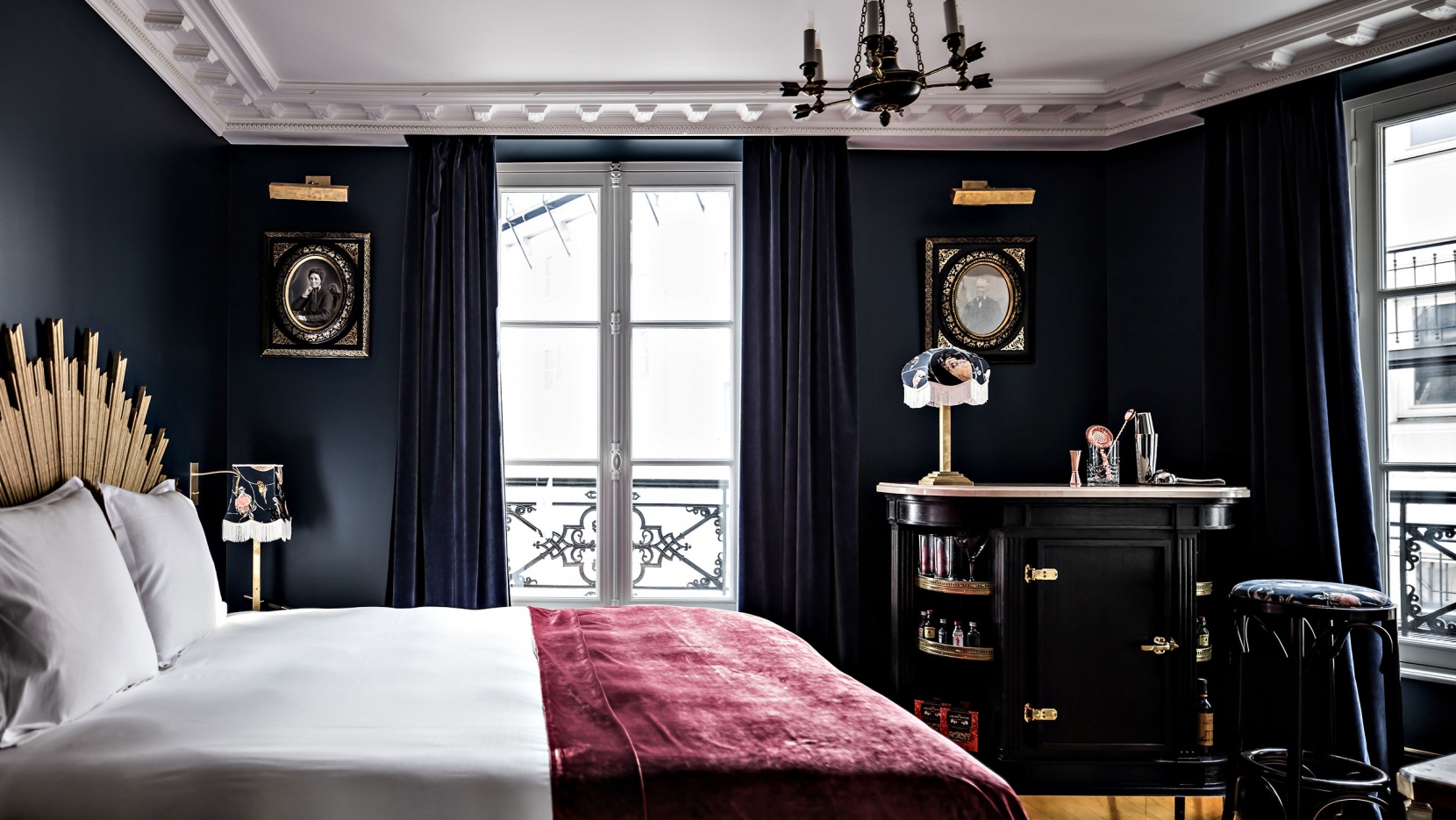
Pink is usually associated with femininity and girlishness. As an overall scheme, it lends an atmosphere of freshness, sweetness, and comfort.
Accents of hot pink or fuchsia add a touch of glamor and sophistication, especially when paired with metallics.
Image: Hotel Providence, Paris
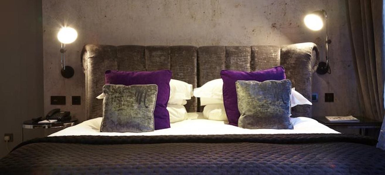
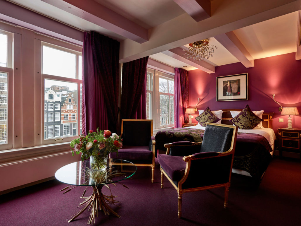
Speaking of sophistication: Purple brings it in spades. Large swathes of it create drama and opulence, perfect for rooms with high ceilings or lots of shiny surfaces. Can you spell baller?
Image: Ambassade Hotel
On the other hand, lavender shades are immensely relaxing and sweet at the same time, which make them perfectly suited for bathrooms and spas.
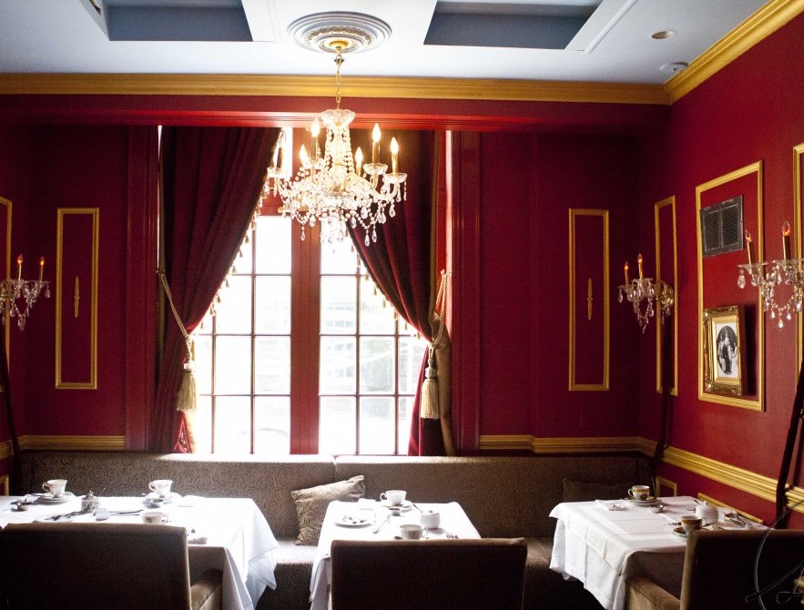
Red, especially bright red, is an aggressive and stimulating color. If you’re using it for the bedroom, it’s best to keep it to a few accent pieces, or possibly an accent wall.
What’s a good area in which to use lots of red? Places where a lot of eating and conversation happen, like a dining area, conference room, living room suite, or any communal area.
Image: Tea Room, Windsor Arms Hotel
Neutrals like white, black, gray, and brown are generally used as a backdrop or balancing element for more vivid centerpiece hues like red, yellow, and blue.
Earth tones like clay, sand, mushroom, and bark are relaxing and provide a sense of stability in hospitality design. However, they can be boring or outdated.
Hotel Interior Design Trending Color Palettes for 2018
According to Leatrice Eiseman, executive director of the Pantone Color Institute, metallics are giving way to neutrals. Pearlized, iridescent, and translucent colors will continue to infatuate, as “the human eye can absolutely not avoid” being intrigued by shimmers.
Pastels are also on their way out, to be replaced by intense colors.
The health trend is still going strong, and is in fact bleeding into interior design, as well. Verdant greens combined with berries and eggshell-blues are becoming more popular.
Image: Pantone
“People need to stop and smile,” says Eisman, which is why playful palettes are also on the rise. Canary yellow, lime popsicle, and bright purple is a good example. “Think Minions,” Eisman says.
Image: Pantone
Blue and orange, especially those in a flame, have always been a classically complimentary palette. It’s still in style, in fact, perfectly balancing cool and warm.
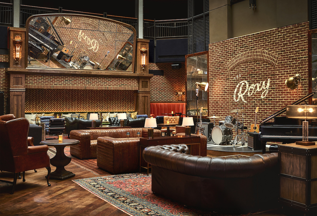
Tasteful, non-boring earthy palettes are an oxymoron, but also a very current trend. This is especially true for palettes that incorporate rosy hues.
Image: Roxy Hotel, New York
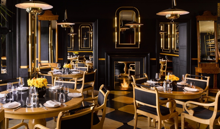
Drama is still very much in vogue in hotel interior design. Deep, bold colors, accented with metals, evoke power, strength, and sophistication.
Image: Blakes Hotel, London
Have you designed a hotel? What color palette/s did you use and why?
We hope you enjoyed Part 1 of our series on hotel interior design. We’ll publish the next installments over the next few days — sign up for our newsletter to get them right in your inbox! In the meantime, give Fohlio a try and see how much more efficient your FF&E specification process can get.
Manage FF&E specification, procurement, and product data at scale. Take on bigger projects with confidence and grow your firm with Fohlio. Schedule a...
Manage FF&E specification, procurement, and product data at scale. Take on bigger projects with confidence and grow your firm with Fohlio. Schedule a...
Manage FF&E specification, procurement, and product data at scale. Take on bigger projects with confidence and grow your firm with Fohlio. Schedule a...